Earlier this year, we were brought on to design the set for OTK Network's new anime discussion podcast called Noodle Shop. Since your resident blog writer officially joined C. Scenic for their weeb knowledge, this project was right up their alley, so under the advisory and supervision of the one and only Grand Poobah, Paul Warmus, Morgan- or I?- took on the design of a three-wall set from the perspective of a ramen bar kitchen.
Initial Renderings

Prior to the entire process, Paul provided a quick sketch of OTK's ideas for their set. It was a straightforward concept - a ramen shop with the hosts sitting at the bar counter. The spin would be that the cameras (and subsequently, the audience) would be placed in the "kitchen" area, looking out into the restaurant. So the next part of the design process was...
Research


I spent about five years living in Austin and several college breaks visiting the city beforehand. Deep down, Austin is my first home, and one of my absolute favorite places to be were the variety of ramen shops throughout the city. From the iconic first location for Ramen Tatsu-ya to my personal favorite, Kanji Ramen. I wanted to incorporate elements from these locations to honor where OTK resides and the city I loved.
One of the key notes that OTK passed on to us was that this set needed to be relatively bright. Most ramen shops are filled with mood lighting and dim ambience, so finding bars that were well-lit and a bit lively was a small challenge. Thankfully, Ramen Tatsu-ya was a great point of reference and inspiration!

First Design Pass
With lots of research compiled, the next step was to take Paul's concept rendering and bring it into a 3D space while incorporating design elements from the inspiration references. Pulling from the brighter noodle restaurants, I decided to make the primary wall color white, and paired with that, I knew red would have to be the primary accent color based on the logo we'd been shown and so, sought to incorporate it low onto the walls the way booth seating would be arranged in an actual noodle shop with deep crimson upholstered fabric.
To provide choices for our client, I mocked up two variations to the design. The first was a lot closer to Paul's first drawing, with three back walls segmented by two columns and angled at about 35 degrees off the side walls.

The second included two wider walls and a narrower center wall with more narrow shelving and a different style of upholstered paneling.

I initially wanted to incorporate a mural element since that type of art feature can be seen frequently across ramen shops all around the world, and with a white wall, I immediately imagined iconic manga panels displayed as a collage on the back center wall. Although this element didn't really stick, I'm still a fan of the concept.

Second Design Pass
After going over the first set of designs with the client comes the second pass with requested revisions. And the good news was - not a lot of changes were really needed! The OTK crew really liked the first design with the three evenly sized walls. Our two big notes were that nothing could be hung from the ceiling, so the lantern and flag elements had to go, and instead of the mural wall, they wanted to include their logo as a large-scale backlit feature.

I was personally pretty indecisive on the materials to be used on the desk, so I rendered out a few variants to provide as options. In the end, however, the black subway tile, cork, and black laminate countertop of the first design round carried through to the end.

The Build
With the design approved by the client, it was time to start the build. Unfortunately, it turned out that the timing for this project collided with another big build we were in the middle of completing, and we weren't going to have the space or hands on deck to tackle things. But of course, C. Scenic has many allies in this field, and we passed the instructions onto friend of the shop and owner of Acme Sets, Roy Metcalf, who knocked the fabrication out of the park in just a few weeks.

There were a few hiccups in the process, such as dimensions needing to change due to the set location changing in the studio and the initial material sourced for the "silk" panels not working out. Thankfully, Roy's many years of experience and expertise found solutions to every problem, such as utilizing muslin for the panels as opposed to the other fabric I had sourced.


Of course, the biggest change that came about was having to downsize the entire set pretty significantly. This affected the desk the most, as it still needed to be able to seat four people. Getting to see the desk in-person as opposed to on the computer screen was a real treat, nevertheless, and it really helped my confidence in the material choice.
Set Dressing and Decor
OTK wanted to handle the decor themselves, but we were tasked with providing the set dressing for the "ramen bar," such as the kitchen elements. This included things like ramen bowls, a tea set, tea canisters, and seasonings, among another handful of items. This part became my personal favorite design project, since more of my background is in graphic design and product marketing and photography. I took it upon myself to design custom labels with a variety of easter eggs for the wine bottles meant to decorate the shelves of the set.


I created nearly 20 custom graphics for all kinds of bottles, from wine and liquor to cola and beer. For the larger alcoholic bottles, I included the year of the anime's debut and tried to keep the references varied from classics like 1963's Astroboy to the 1997 run of Berserk and the more modern works like 2018 and 2021's JoJo's Bizarrre Adventure. For some series, I kept the name and logo as it was originally designed, but I got a little more specific and obscured, such as using the Vongola crest for Katekyo Hitman Reborn! and a huge manga spoiler for One Piece for anyone following the extremely recent developments (as of March 2022.)
I also had to reference two of my favorite anime's different cola "brands," so I sourced the graphic for Senku Cola directly from the anime, Dr. Stone. The Bepsi logo is a reference to my favorite character Yasutomo Arakita in Yowamushi Pedal, as it is the only type of soda he drinks.


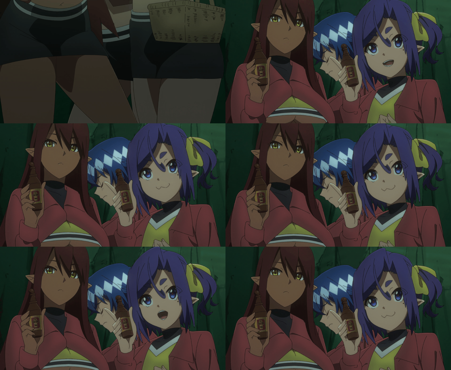
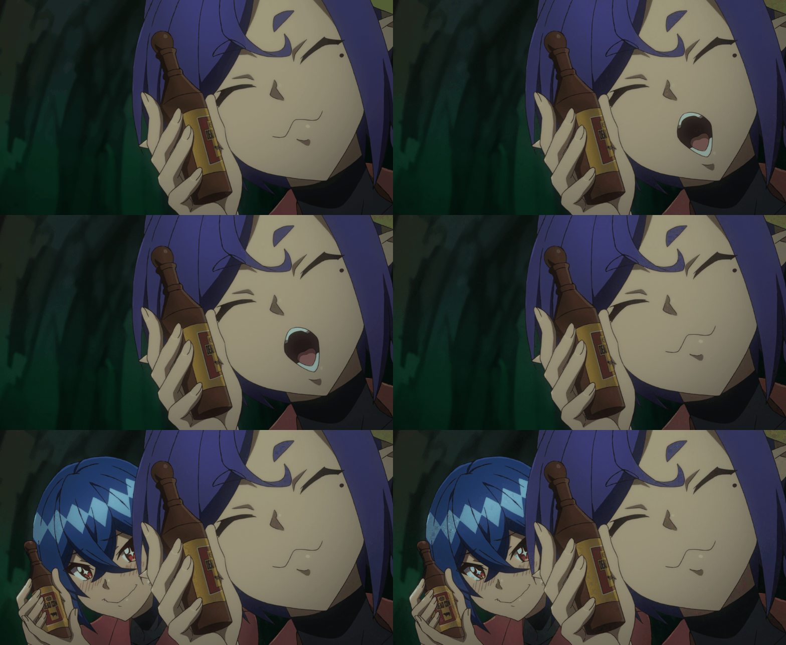
Finally, the last special easter egg for the bottles was a nod to my first ever named anime role in Dungeon of Black Company. (Oh yeah, I'm also an anime voice actor, by the way.) Dead Cow is a knock-off Red Bull energy drink that my character, Ranga, peddles for her party leader's, er, entrepreneurial efforts.
The Official Set
Once everything was finished at Acme Sets, our guys picked everything up and hauled the set and decor down to Austin for the install. The good news was that it was a fairly smooth job, at least from what the crew reported back. For my first real set design, it was a bit of a relief to not run into too much dramatic trouble, and most importantly, the OTK gang was thrilled by everything.

Designing this set has been a real highlight for me and my extremely eclectic career. The opportunities C. Scenic has shared with me over the years are something I really appreciate and have endless gratitude for. I've certainly learned a lot. I'm also thankful that OTK sought us out for this set! We live for unique projects like this one, where there's a clear idea and theme in mind with the freedom to get funky with it.
If you haven't checked it out yet, Noodle Shop Podcast updates every Monday at 9am EST on YouTube. Tectone and Rich might have some pretty trash anime opinions, but at least Emiru has some real taste! (C. Scenic Disclaimer: Morgan's anime opinions do not reflect that of the company.)
The first episode is here, and if you check out the first couple minutes, you'll get to see the gang gush over the set a bit. Give them a thumbs up, smash that subscribe button, hit the bell, whatever it is that YouTubers need for engagement nowadays, and stay tuned for more! Thanks for reading!


